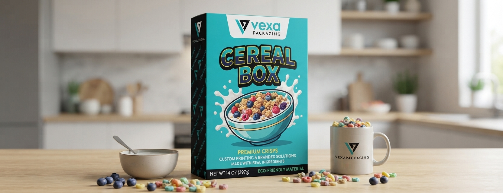
There is hardly any other package that is more hard working than a cereal box. It must advertise itself within less than three seconds and be able to amuse a child over weeks through breakfast. That each of its six sides has a task to be performed, but that the back of cereal box panel and the side panels that run along the front have the bulk of that task. Get them right and you have an informative package that entertains and can last a complete production run without reprinting. Miss them and you have compliance flags, paperboard and a box no-one can recall.
This tutorial will subdivide what is on each side of the cereal box, the most valuable real estate in the entire design is the back panel and how to print and fold it all out the first time.
A typical cereal box is a 6-sided box and all sides of cereal box have their own role to play:
In case the front panel sells it, the design of the cereal box back makes the relationship. It is this panel that makes a one-time purchase a returning customer and why cereal brands have placed so much reliance on it over the decades.
Cereal brands worked out long before packaging contained QR codes that the reverse side of cereal box could be used as entertainment. Short comic strips with the brand mascot, mazes, word searches, connect-the-dots puzzles and short comic strips provided kids with a reason to linger over the box during breakfast time. This was no filler content and was a good intention strategy to have the brand exposure as long as possible after the purchase. A kid playing with a maze on that panel is spending several minutes interacting with the brand, by far more than a single look at the aisle.
Character telling is useful to both adults and children. A catchy mascot with a touch of story; a joke, a mini-adventure, did you know a fact; creates familiarity as the purchase is made over and over again, which is what any brand of packaged goods needs on a weekly purchase.
The rear side has not been idle. Nowadays it is equally probable that it contains a QR code leading to a mobile game, a sweepstakes or an augmented reality view in which a phone camera makes the mascot come alive on the kitchen table. Web links refer to recipe hubs, loyalty programs or brand content to sustain the relationship even after the box is emptied.
These upgrades do not substitute the usual maze; they add to it. Most boxes combine the two: a printed puzzle at the time and a digital hook then. It is that mix that makes the design briefs of this panel more complicated, rather than less expensive, despite the fact that printed games are still a staple.
The two panels of the cereal boxes side are very narrow and the responsibility is divided between regulatory duty and brand voice.
Side 1: The FDA Information Panel
The Nutrition Facts panel and the complete ingredient list with the allergen declarations are located on this side. The reason is it is the least adaptable real estate in the whole box since it is not determined by design preference but strict label law. The size of the fonts, sequence of the items listed in the order and the call-out of allergens are not based on the whims of the design team, but on regulation.
Side 2: The Brand Mission Panel
It is on the opposite side panel where the brand has an opportunity to speak. Sustainability claims, organic certifications, and non-GMO badges are found here. It is their marketing text masquerading as an assurance to a shopper who has already turned the box upside down that they are as valuable as the product they are promoting. This side is not limited to information like the information panel, it has actual creative freedom and more and more brands are using it as a means to distinguish not just based on taste.
These two cereal box sides provide the answer to the two questions an actual shopper asking the label reads: What is it in? and What would this company represent?
The box has the smallest panels that deal with the most operation.
Top flap: Here the expiry dates and batch numbers reside, as well as the tuck flap that can be re-closed to keep cereal fresh between pours. It is mechanical as much as informational; the flap must close, tuck and re-open hundreds of times without tearing.
Bottom panel: UPC barcode and SKU numbers are placed here, with recycling symbols and any material-composition codes necessary to the paperboard. This panel is seldom creatively handled, and a barcode mismatch is as likely to hold up a product at the counter as a marketing error will hold it up at the shelf.
Nutrition labeling is not voluntary and not haphazardly applied. The FDA establishes stringent regulations on:
Any of this is not a cosmetic matter, it is a compliance matter. Even a point smaller font, or a list of ingredients out of sequence can cause a print run to be rejected, or worse a recall once the product has been shipped. It is the correct placement of the side-panels in the design stage that avoids a brand discovering a mistake in labelling only when tens of thousands of boxes are printed. One of the costliest errors made by a packaging department is to reprint a complete production run due to a technicality in the labeling, hence the regulatory review should be considered in the initial stages of the design, rather than in the final ones.
Transforming a design file into a three-dimensional box requires a thought process of a printer rather than a designer.
Bleed lines and score/fold margins:
Each panel should be cut to a bleed beyond the trim line to ensure there is no white edge visible in the cut paperboard and score lines indicated where the paperboard will fold between the front, sides, back and flaps. Misalign the fold margins and text or pictures intended to be on the front panel will be stretched to wrap on its side.
Paperboard choices:
Solid Bleached Sulfate (SBS) board provides the smoothest, whitest print surface and is used as a standard of high-color front panel. Eco-friendly kraft board provides a more sustainable, recycled alternative, with a small tradeoff to the vibrancy of print, which many brands now make a deliberate tradeoff, as the natural feel of kraft has become a visual shortcut in the visual signifier of sustainability on shelf.
High-definition CMYK printing:
Small, crowded text is used in Nutrition Facts tables and ingredient lists and it must remain crisp at scale. The legible fine text is retained with high-definition CMYK printing and bold, saturated color on the front and back is replicated. Before printing a lot of the small text, printing companies typically will create a full size proof to check the readability of the small text.
1. What is the length of a side of a cereal box?
This usually is referred to as the Information Panel since all the Nutrition Facts, ingredients, and allergen information that the FDA requires is placed on this side. Other side there is referred to by people as the brand
2. What is the purpose of games on the back of cereal boxes?
The back of the box has games, mazes and character storytelling that continue to engage the user long after the time of purchase. Spending a couple of minutes at the breakfast table with a puzzle a child or an adult is spending those couple of minutes with the brand and is creating a stronger memory and a brand loyalty to a product that is normally purchased on a repeat basis.
3. What are standard cereal box panel dimensions?
The size of the dimensions differs according to the product line and box style, but the majority of cereal boxes have sizes that are between 7.5 and 8 inches wide, 11 to 12 inches high and 2 to 2.5 inches deep.
The width of the panels in front and back is determined by the width of the box and the two side panels are determined by the depth, which in turn is also the main limitation concerning the amount of copy that can be practically placed in the Information Panel.
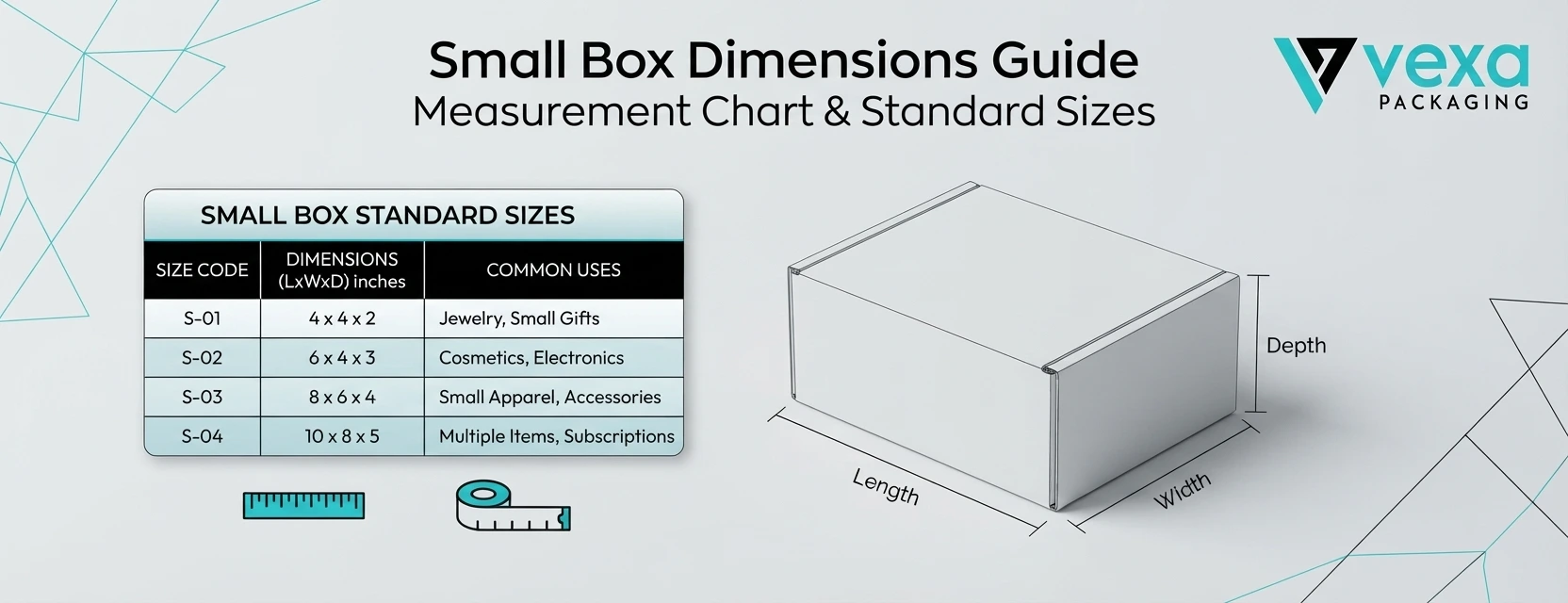
The choice of the correct box size seems small but it will impact safety of your product, shipping costs and the perception of your brand to your customers. That is...
There is hardly any other package that is more hard working than a cereal box. It must advertise itself within less than three seconds and be able to amuse a...
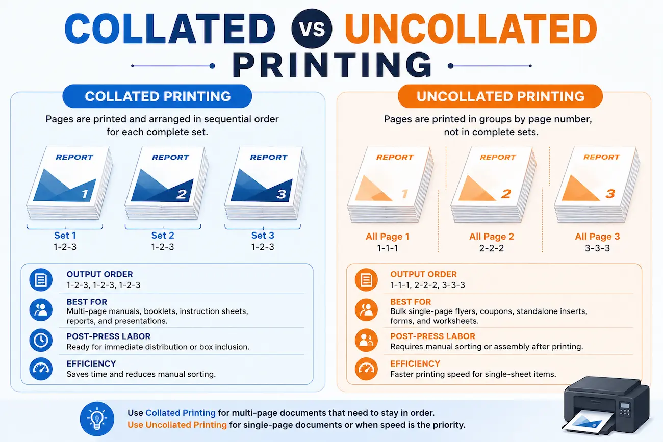
Imagine that you just printed 500 pages of a 50-page training manual and are now manually picking up the sets at the copier. This is the reason collate printing was...
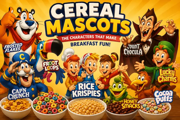
Pick up a bowl and sit down, for we are going on a colorful, chaotic and wonderful journey through the history of cereal mascots. These cartoon characters make the mundane...