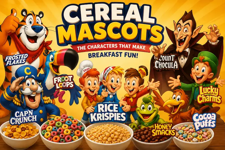
Pick up a bowl and sit down, for we are going on a colorful, chaotic and wonderful journey through the history of cereal mascots. These cartoon characters make the mundane grocery shopping trip something to dream of and brands are aware of that. Boxes with an animated character are 32% faster at selling than boxes without an animated character, according to a survey of the packaging industry conducted in 2022. That one number is why, for decades, the tigers, toucans and talking rabbits have been competing for shelf space.
This guide explains all of the characters who founded the breakfast aisle. We’ll be counting down the classics, discussing why marketers are still going crazy over these cartoons and demonstrating exactly how a clever Vexa Packaging partner can turn a cartoon drawing into a “must have” box. Sitting up straight, this is the deepest cereal mascots list you will find on the web.
Children don’t read the nutrition panel, they just remember faces! The idea of cereal characters is that people’s brains see eyes and expressions before anything else on a crowded shelf. According to Neuromarketing research at Cornell University, a shopper’s gaze lands on a mascot’s eyes in 400 milliseconds, before the brand name. The instant connection creates a kind of “mascot equity,” the kind of brand recall that overstays the lifetime of any product reformulations.
Take this for example: breakfast cereal characters still exist on cereals that adults can remember from their childhood years, well after the cereal formula was updated and changed three or four times. Since 1952, Tony the Tiger has been the mascot for Frosted Flakes and he is still on the box today. This is more than 70 years of visual consistency, using a single character to do it. It is over 70 years of consistent visual branding by means of a single character, a feat that few other advertising formats can match.
This isn’t just breakfast cereal mascots, it’s the breakfast cereal itself. During the early 20th century, cereal companies began to emboss a farmer or chef onto plain cardboard; this was accomplished for the most part due to the inability of color-printing technology to print much else. Until offset lithography evolved in the 1950s, this was no longer an option, as it became possible to print bright, multi-colored characters at a low cost and in large quantities for the first time.
These mascots were given a second life with television. When cereal companies saw that a cartoon character could sell cereal on television and then come to breakfast, the golden age really began. In the 1990s, packaging industry archives show that about 80% of the top cereal brands found on US shelves had their own mascot and it was an explosion driven directly by the fact that the cost of printing cardboard tuck boxes for regional brands had finally fallen to a level where they could compete with the giants such as Kellogg’s and General Mills. It is this printing advance that led to the proliferation of cereal mascots during just one decade.
Nerves are jangled and it’s time for the main event? Below is a scannable cereal mascots list organized by brand, debut year and packaging characteristic to help you locate the perfect cereal for any event.
| Mascot Name | Brand | Year Introduced | Key Packaging Feature |
|---|---|---|---|
| Tony the Tiger | Frosted Flakes | 1952 | Bold orange-and-blue color block |
| Toucan Sam | Froot Loops | 1963 | Rainbow gradient wrap-around |
| Cap’n Crunch | Cap’n Crunch | 1963 | Nautical gold foil accents |
| Snap, Crackle & Pop | Rice Krispies | 1933 | Trio character grouping |
| Count Chocula | Count Chocula | 1971 | Glow-in-the-dark Halloween run |
| Lucky the Leprechaun | Lucky Charms | 1964 | Marshmallow shape callouts |
| Sonny the Cuckoo Bird | Cocoa Puffs | 1962 | Wide-eyed close-up crop |
| Dig’em Frog | Honey Smacks | 1972 | Green-and-gold contrast panel |
These three cereal mascots are kind of the originals of the mascot playbook. The slogan “They’re Great!” does for Tony the Tiger what the “They’re made from healthy fruits and veggies and have the fiber content of a grain!” does for Cap’n Crunch, and the “What do you think it will be like?” does for Toucan Sam. In both designs, the designer’s choice of shelving elevation is to position the face of the character at the child’s actual eye level as in the present invention.
Mascots and monster characters were another thing altogether. Snap, Crackle and Pop provided Rice Krispies with an instant sound effect, as well as a set of three that created a mini-comedy on the screen. Meanwhile, Count Chocula and his cast of monster breakfast cereal characters made seasonal packaging an event in October and not just for Halloween sales as limited editions continue to boost sales even beyond the summer of their birth.
The 1980s and 1990s saw the highest number of memorable cereal characters in a cereal era. In a decade, dozens of new characters hit the market, all competing to be cuter and more charming than the others and all on the same supermarket aisles. During the 2021 consumer nostalgia survey, millennials were able to identify a cereal mascot from just its silhouette 74% of the time, a result that beat most of the logos that are part of the Fortune 500 companies.
Ever seen almost all cereal box characters look straight at you instead of off to the side? That’s intentional. Shelf-behaviour researchers have identified that packaging that is more forward-facing can extend dwell time by almost 15%, which provides the brand with a few precious seconds.
Just as with eye contact, the color of the eyes is important. Why so many boxes with the cereal character(s) are using red and yellow colors behind them is because red and yellow are the combination that will trigger hunger faster than any other color combination. Designed in a contrasting color, the characters in the illustration emerge from the background and don’t merge with the noise of a crowded aisle; the cereal characters are then naturally connected to the promise of flavor on the cereal box next to them.
For years, the cereal aisle seemed to be almost exclusively dominated by male characters and few female or non-binary characters were available. Industry audits suggest that less than 15% of iconic cereal mascots launched prior to 2000 explicitly featured a character that was a female. Before 2000, far fewer than 15% of iconic mascots were actually female but newer direct-to-consumer cereal brands are attempting to close that gap.
Some brands, such as Magic Spoon have created modern icons based on the idea of inclusivity and humor, not just a sense of a past era; and a new icon can prove to be a game-changer in a category that relies on icons more than 70 years old. Today packaging design is far from simple, it is done in a way that takes representation seriously as a true differentiator, rather than an add-on to an established template.
If the printing process is unable to reproduce the great design on the shelf, it’s worth nothing. The first is paperboard stock solid bleached sulfate (SBS) board is ideal for brands wanting to play with mascot colors, while Kraft board is perfect for brands aiming for rustic, sustainable styles.
Fine details, like fur tone, eye highlights or whisker lines on cereal characters aren’t lost during high def CMYK printing, which is important when you’re selling them from a six-foot distance on the shelf. The job is completed with finishing: gloss UV coating brings colors to life under store light while matte UV finish brings a softer, premium look that many boutique cereal brands are looking for.
Packaging expertise is critical to getting all three elements right, and that’s why food brands are more and more collaborating with the experts and less with their gut. Vexa Packaging considers all these factors on each project and should you desire to see how the technical side of things works, you can read this guide to break down all the specs and finishes of custom cereal boxes printing.
Whether it’s Tony, the Tiger, who still calls the shots after 70 years or Magic Spoon’s welcoming newcomers, cereal mascots continue to be among the most resilient branding elements in the food business. They create recognition more rapidly than virtually any other design element and they will only be effective if the printing behind them is as much as the character’s. From re-launching existing brands to creating a new mascot from the ground up, Vexa Packaging can help you make that character come alive in a box that will sell off the shelf.
A photo of flakes in a bowl just won’t do the job of instantly building an emotional recognition that a mascot will. If a character has personality, it gives kids and parents something to look out for on a crowded shelf and makes it more of a predictable repeat purchase than just product photos.
Tony the Tiger has appeared continuously since 1952 on Frosted Flakes. Snap, Crackle and Pop were advertising Rice Krispies even earlier than that appearing in various illustrations for Rice Krispies cereal since the early 1930s.
A profile view response is a slower subconscious reaction than direct eye contact, so it can attract attention only in a matter of milliseconds when it’s on a busy shelf. This is why the designers of packaging make sure to place mascot eyes at the height of a child’s eyes.
Fine details such as fur texture and eye highlights are not lost in translation with high-definition CMYK printing on quality paperboard stock. Combined with the appropriate gloss or matte UV finish, it will deliver the final visual impact with store lighting.
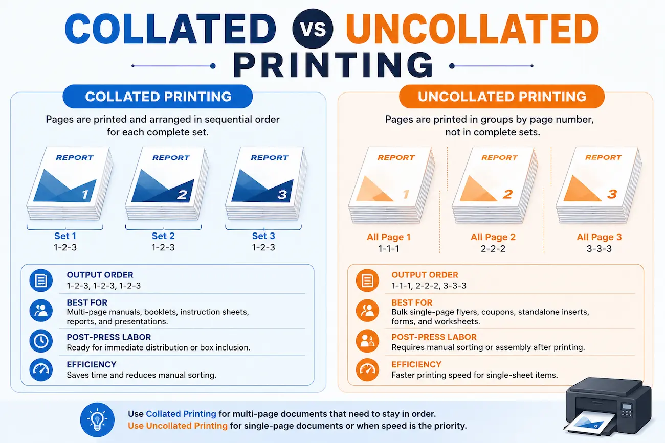
Imagine that you just printed 500 pages of a 50-page training manual and are now manually picking up the sets at the copier. This is the reason collate printing was...
Pick up a bowl and sit down, for we are going on a colorful, chaotic and wonderful journey through the history of cereal mascots. These cartoon characters make the mundane...
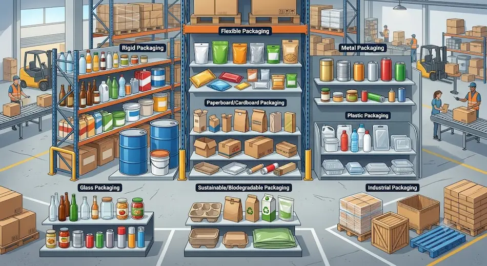
Open it the wrong way and you spoil the moment, brands know this! Whether you’re handling a box, a wrapper or a bag, each item your customers interact with contains...